
Esports team branding basics
A recognisable esports team look needs four things: a logo in three versions, two or three colours that are readable on each other, one font for names and scores, and a one-page sheet that everyone who posts for the team uses. Most teams have the logo; the rest is what makes the difference between a feed people recognise and one that looks different every week.
This guide goes through each part, with the colours of a fictional team as an example, and ends with a brand sheet to fill in.
The logo in three versions
Most team logos are made once, for one background. On graphics, they end up on many. Keep three versions:
- Full colour, for light or neutral backgrounds
- One colour, light, usually white, for dark backgrounds and photos
- One colour, dark, for light backgrounds where the full-colour version does not stand out
Add a square or compact version if the main logo is wide. Profile pictures, Discord icons and the corner of a story are small and square, and a wide logo turns into a line there.
Ask for the logo as a vector file (SVG or PDF) as well as PNG. A vector file stays sharp at any size; a small PNG gets blurry as soon as it is enlarged.
Test the logo at the size it actually appears: as a profile picture in a feed on a phone. If you cannot tell what it is at that size, the compact version is not optional.
Two or three colours
A team needs fewer colours than it thinks. A ground for backgrounds and large areas, a second colour that marks the team, and a text colour that reads on the ground cover almost everything. An accent for one highlight per graphic is optional.
It also helps to keep a light and a dark version of your colours, the way football clubs have a home and an away kit. Our fictional team Nordwind has both:
| Role | Dark kit ("mint") | Light kit |
|---|---|---|
| Ground | Dark green #0e3b3c | Cream #f5f0e6 |
| Second colour | Mint #90f4d6 | Red #c8372d |
| Accent | none | Dark blue #1d3557 |
| Text | Off-white #f4fffb | Not set: black or white, whichever reads better on cream |
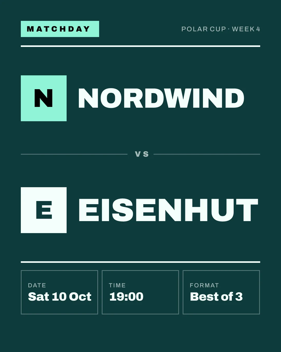
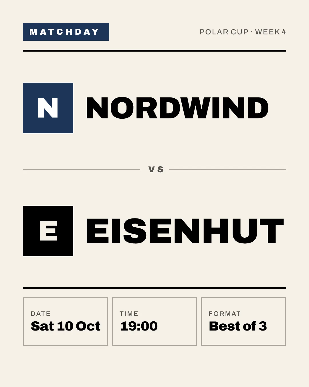
Same team, same layout, recognisably Nordwind in both. The light kit is useful where a dark graphic would disappear, for example next to the light posts of a club's main channel.
The colours have to work on each other, not only next to each other. The web accessibility guidelines (WCAG 2.2) ask for a contrast ratio of at least 4.5:1 for normal text and 3:1 for large text, meaning 18 point, or 14 point bold, and up. They are written for websites, but they are a good yardstick for graphics that are read on a phone in a hurry.
Here are the example colours as pairs, measured with the WCAG formula. Eisenhut, the opponent, plays in red (#c8372d) with white:
| Colour on background | Contrast | Readable as text? |
|---|---|---|
| Off-white on dark green | 12.02:1 | Yes |
| Mint on dark green | 9.42:1 | Yes |
| Dark blue on cream | 10.88:1 | Yes |
| Red on cream | 4.58:1 | Yes, just |
| White on red | 5.20:1 | Yes |
| Red on dark green | 2.36:1 | No |
| Mint on cream | 1.15:1 | No |
Two lessons are in this table. First, if you set red text on cream, it passes, but only just: a slightly lighter red or a slightly darker cream and it fails, so measure instead of judging by eye. Second, the last line is the common trap. Mint looks great on the dark ground and is unreadable on a light one. That is why the light kit does not reuse mint but has colours of its own.
Write the colours down as hex codes. "Our green" means a different green to everyone who opens a design tool.
One font
One bold font for names and scores is enough. A second, plain font for small text is the most you need. More fonts do not make graphics look richer; they make them look like they were made by different people, which they often were.
Pick a font with clear numbers: scores are the most-read part of a result graphic, and some display fonts make a 1 and a 7 look alike. Check the licence before you use it in your logo or on social posts.
Keep it the same all season
A brand is mostly repetition. The same colours, the same font, the same layout for the same kind of post, every week.
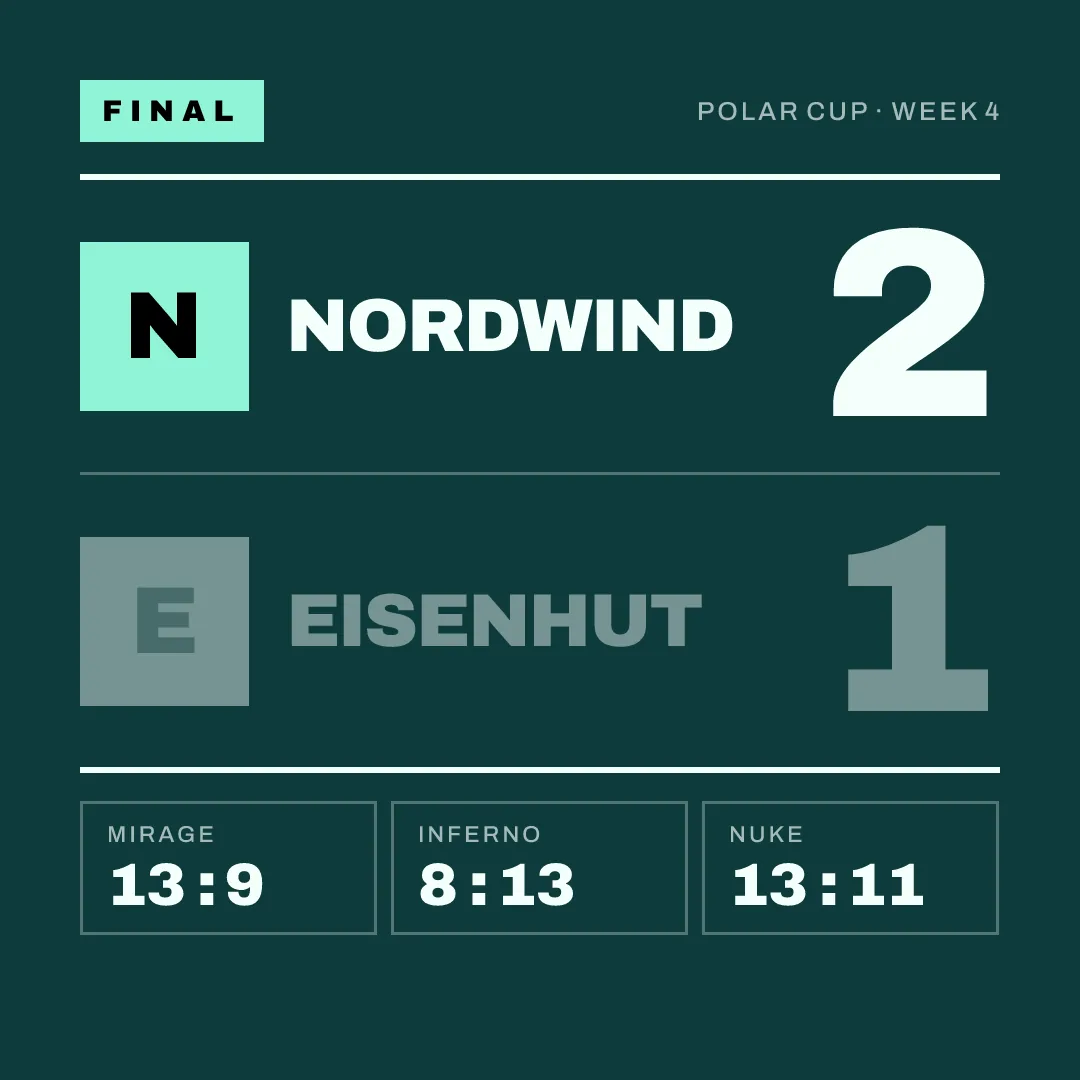
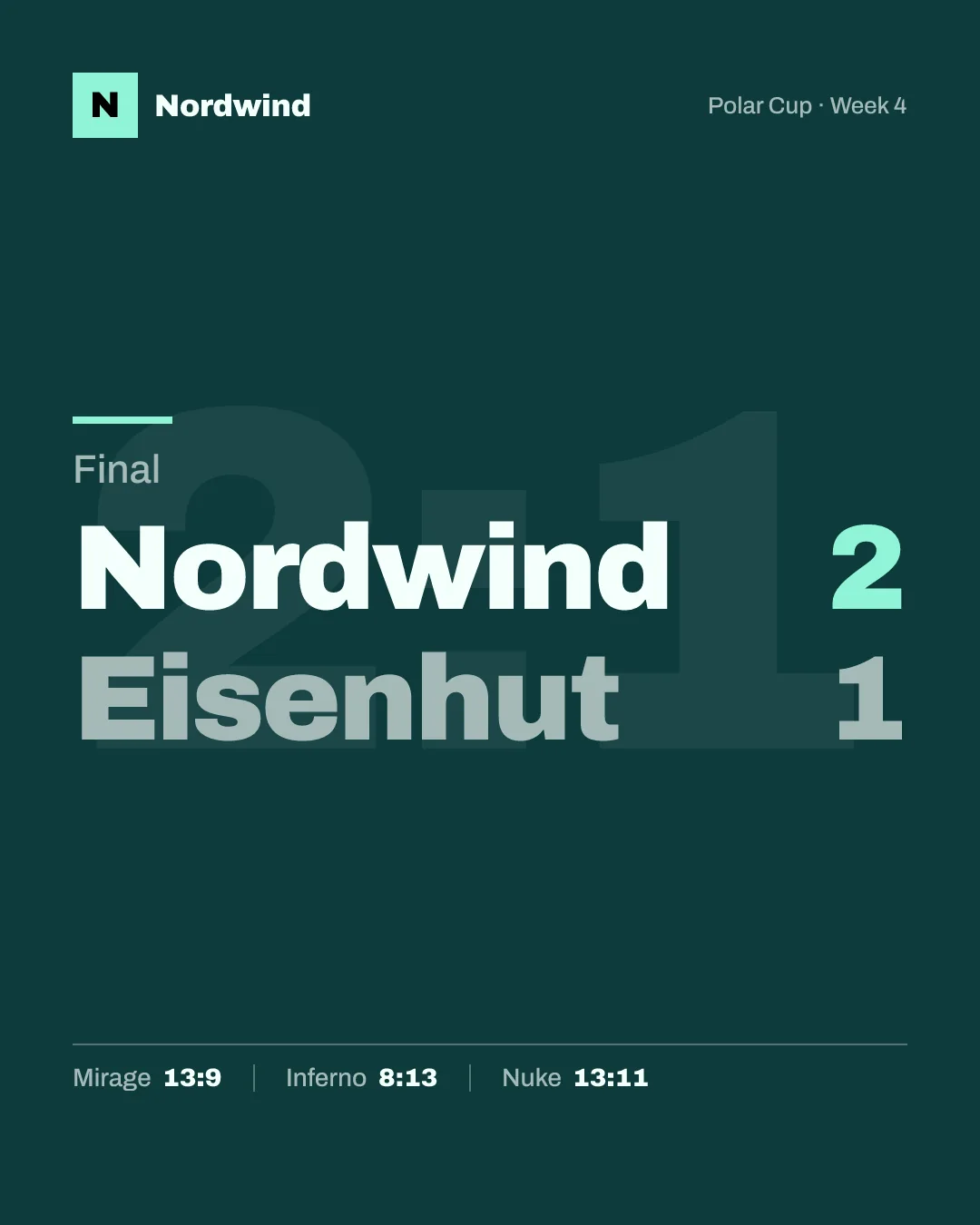
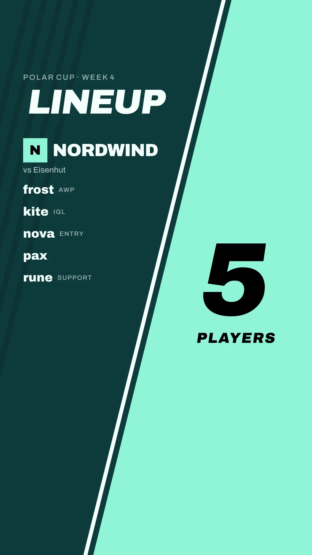
That does not mean one design forever. A new style for a new season is fine, as long as your colours and logo carry over, so people still know at a glance whose post it is:
The easiest way to keep it the same is to write it down once and share it with everyone who posts for the team: captain, social media, the club's press person. That is the brand sheet at the end of this guide.
In a club
An esports department is part of the club, and its graphics should look like it: the club's logo, the club's colours, maybe the department name under the logo. Ask the club for its logo files and any design guidelines it has before you design anything of your own. A department that looks like the main club gets shared by the main club's channels; one that looks like a separate gaming team usually does not.
Set it up once
In gelvik, the brand kit holds your logo and your colours, and the style you pick brings its typeface. Unless you set a text colour, gelvik picks black or white, whichever reads better on the ground. You set it up once, and every graphic uses it. The matchday guide shows which graphics a match needs. gelvik launches in early 2027; join the waitlist to hear when it opens.
Your team's brand sheet
Copy this, fill it in and pin it where everyone who posts can find it.
Logo
- Full colour version: file name and location
- One colour, light: file name and location
- One colour, dark: file name and location
- Compact or square version for small sizes
- Vector files (SVG or PDF) available
Colours
- Dark kit: ground, second colour, text colour and accent (if any) as hex codes
- Light kit, if you use one: the same four
- Contrast checked for every text colour on its ground: at least 4.5:1, large text at least 3:1
- Accent used as text only on the ground it was checked against
Font
- Headline font, and where the licence is stored
- Text font, if any
Rules
- One layout per post type, kept for the season
- Who may change the brand sheet
Sources
Checked on 15 October 2026:
- W3C, Understanding WCAG 2.2, Success Criterion 1.4.3 Contrast (Minimum): https://www.w3.org/WAI/WCAG22/Understanding/contrast-minimum.html
- Contrast values computed with the WCAG relative luminance formula from the colours of the fictional example teams.